Mobile browser quirks
The mobile web supports the LMS but has a few quirks. This article covers the ones that trip learners up.
Before you start
You need to be on a phone or tablet browser.
Step 1 — Screen too small for authoring
Course editing on a phone works but isn't the ideal experience — the editor sidebars collapse and drag-and-drop is fiddly. Reserve authoring for a laptop; use the phone for consumption.
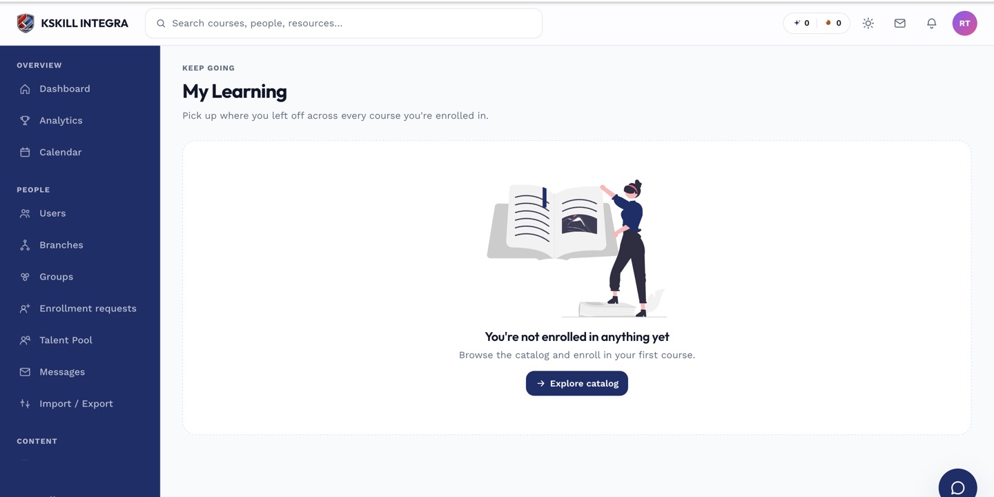
My Learning is the learner's default landing page — every enrolled course is one click away.
Step 2 — SCORM in-frame issues
Some SCORM packages don't respect the mobile viewport and display cut off. Try landscape orientation, or open the SCORM in a new tab. Persistent issues point at the package, not the LMS.
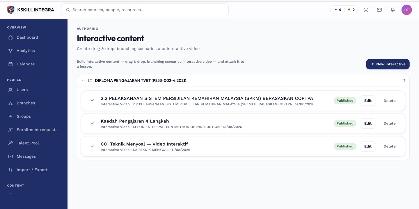
The interactive-content library is where uploaded H5P and SCORM packages are managed.
Step 3 — Auto-play video restrictions
iOS Safari won't auto-play video with sound. The first play needs a tap. This is a Safari policy, not a bug — subsequent plays in the same session work as expected.
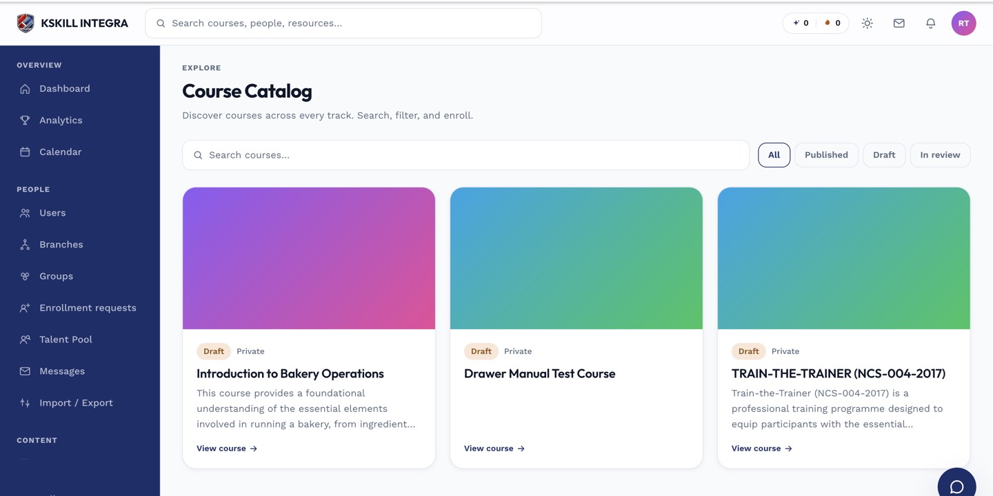
My Courses is the learner's grid of everything they are currently enrolled in.
Notes
- For a dedicated app-like experience, add the LMS to your home screen — modern browsers install it as a PWA.
- Live class join via LiveKit needs Safari 15+ on iOS.